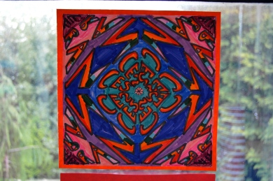
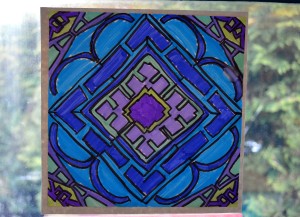
This is my first “Tried and True” lesson, and you can expect to see them from time to time. As much as I would love to come up with my own ideas all the time, there are some really fantastic art blogs already out there. This term in Grade 5 we have to tackle “A2 create images using the image development strategies of rotation and reversal,” as described by the BC Ministry of Education, so I was looking for some way to get this requirement out of the way so we can start our animation unit (!!!)
Thanks to my art lesson Googling prowess, I found a great lesson online that uses super easy to find materials and challenges my students just enough. Without further ado, I give you…the link!
http://www.teachkidsart.net/kaleidoscope-name-design/
Teach Kids Art has this great easy-to-use tab on the side that lets you browse lessons by artist, holiday, geography, process, and medium. I will definitely be using it in the future. I checked out the Thanksgiving tab and it is decidedly lacking in hand turkeys, so they have even managed to post meaningful holiday lessons.
Learning Intentions:
- Students will be able to show that they understand how to create a mirror image. (BC Grade 5: A2 create images using the image development strategies of rotation and reversal)
Tricky Spots:
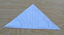
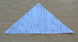
- Step 3: Make sure students know to write their names out first so each letter touches the top and the bottom of the triangle. Maybe even make sketching the “bones” first a mandatory step, before they can add the “flesh” (fleshing it out).
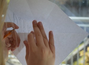
- Step 5: No light tables? No problem! Tracing on the windows works well even if it makes your arms tired.
- Step 6: They had a really hard time with this step! A lot of them had a hard time understanding they would have to flip their template triangle over so it was facing the window in order to achieve the proper mirroring effect. Some hints you can give: The side of the triangle you drew on doesn’t always have to be facing you. The first letter of your name should always be on the inside, or always on the outside.
And as a final heads up, colouring in took longer than I thought.
